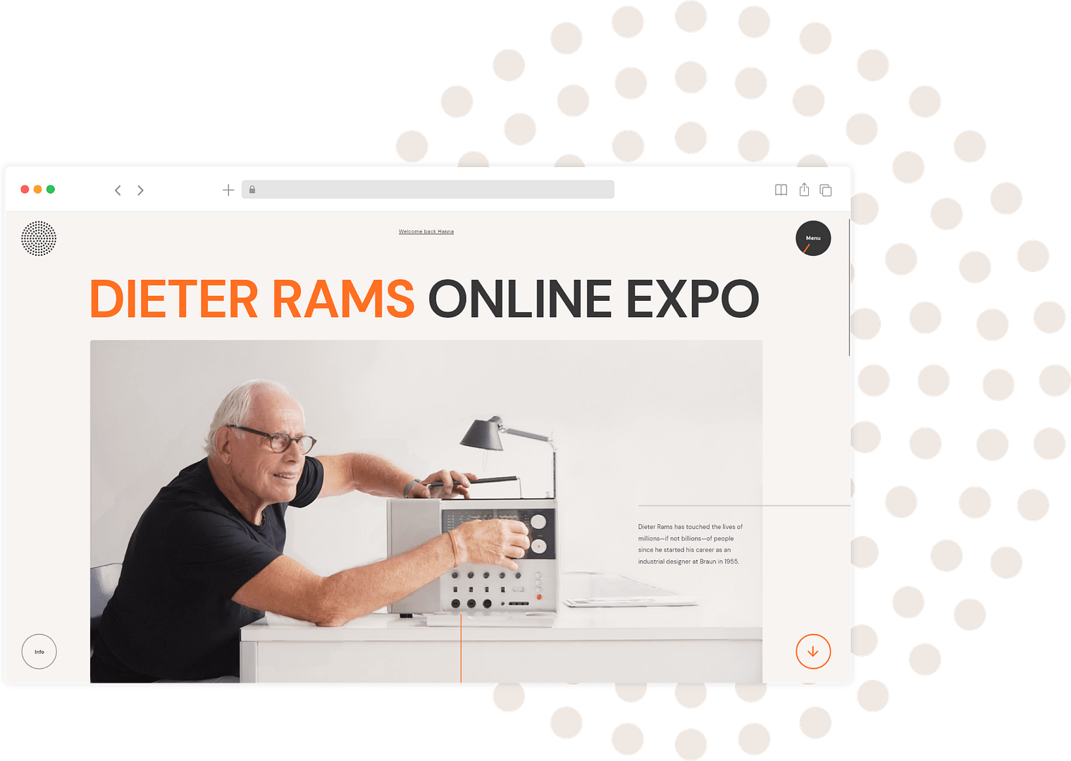
Using a web platform, I designed an interactive exhibit about Dieter Rams' appliance designs and his timeless philosophy for inspiring designers.
Target
Those who wish to learn from a ‘guru’ to enhance their skills for functional, timeless, and minimalistic designs.
Challenge
Realize Rams’ dream and educate designers to create a better world by emphasizing the role of design and technology. I must generate their interest and gather all the scattered information in one place.
Design process
01
Research
Comparative Analysis Red Route Analysis User Persona User Interviews (11)
02
Synthesis
Brand Identity Feature Sitemap
03
Prototype
Sketches Wireframes Hi-Fi Prototypes Design System
Research
Interviews
Over ten designers of various ages and stages of their careers were interviewed. Among industrial and product designers, Dieter Rams is especially well-known and appreciated, but graphic designers and illustrators are unfamiliar with him.
Roi – a UI / UX designer, one of my interviewees
User Persona
The curious designer
He is familiar with Dieter Ram’s works and wants to get more inspiration. Age range 24–40 years old Location Worldwide Technology Sophisticated
User journey
He has never taken part in an online exposition. He is most likely to view the expo alone on the desktop when it is quiet in the evening or at night. He will attend the expo again to gain inspiration. He prefers linear storytelling. However, he would still like the option to jump quickly between subjects.
User's interests
Ram’s philosophy and where it came from interests him. He wants to see behind the scenes the sketches, prototypes, inspiration, and the influence of World War II on his works. Furthermore, he is interested in knowing how he influences Apple and other companies and how we as designers can use design for functionality?
Competitor analysis
Since there are no direct competitors, I researched Dieter’s indirect competitors. The common denominator is that they all tell stories.
Online information is scattered. Traveling to distant museums can be difficult, especially since covid is circulating. Online book ordering isn’t always convenient for some people.
No commitment
If you have already paid for an exhibit and maybe brought friends or family, you might feel compelled to stay until the end. However, on a website, you might lose interest very quickly.
Exhibition at the Design Museum in London.
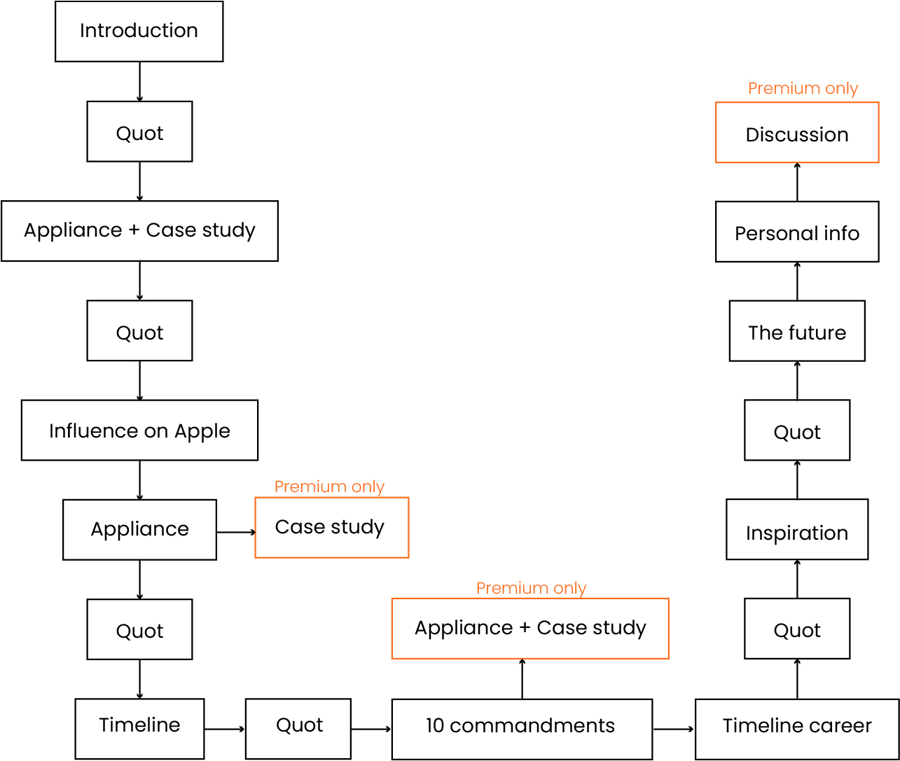
Information architecture
Then, I made a hierarchy of my many ideas based on the website’s goals and the users’ needs.
Low fidelity wireframes
Main features
Story telling
Through a long-scrolling site, I designed a linear, step-by-step experience. It creates excitement and engages users.
The sticky navigation
You can always see your current location and quickly navigate with the turnable button. It gives a sense of orientation and control.
A riddle
Interactivity
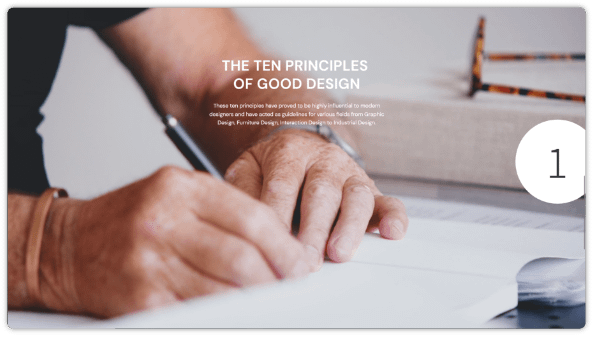
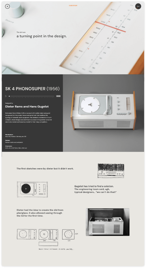
You can choose your interests, answer riddles, read or listen to impressive product case studies, etc.
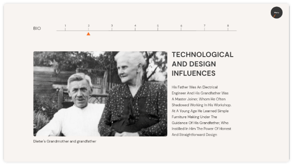
Biography timeline with navigation and the option to see more related pictures
upgrade to unlock all content and enjoy whole experience >
A freemium website
The site will inform you that you can try out premium features for free, then pay to access them all and return them whenever you like. Those who pay tend to stay on the site longer.